BALTIC CHAIN TOUR
New logo and visual identity for an annual pan-Baltic cycling competition.

The logo
The design of the countries was simplified to better reflect the energetic and dynamic nature of sports, while the type was changed from rigid and blocky to loose and off-kilter to be more welcoming and friendly.
THE VISUALS
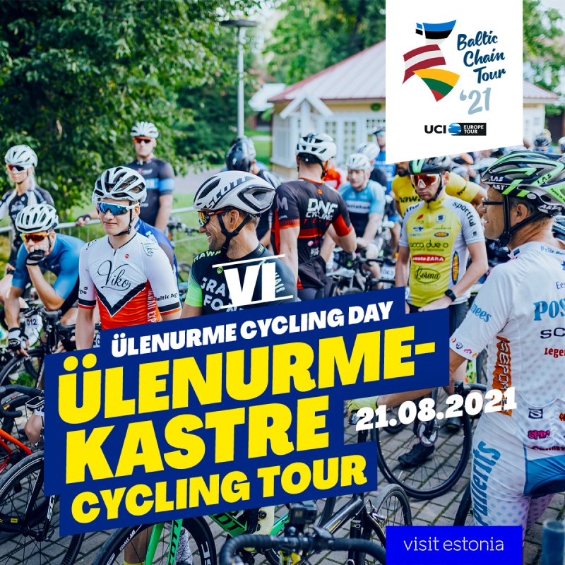
The competition has several sub-events, which had established colors but no true visual connection to the main event. The goal was to change that, so spectators and locals would better see the event as a whole.
While the established colors were kept intact, the typography and graphic elements were unified with the main event for cohesion in the marketing, such as Facebook events.